 | IN DISCUSSION
The Institute of Fine Arts and The Frick Collection Symposium on the History of Art
2022 Symposium on the History of Art
The 2022 Symposium on the History of Art was held via Zoom on April 8th and 9th. Live captioning was provided for each session
Friday, April 8, 2022
3:00
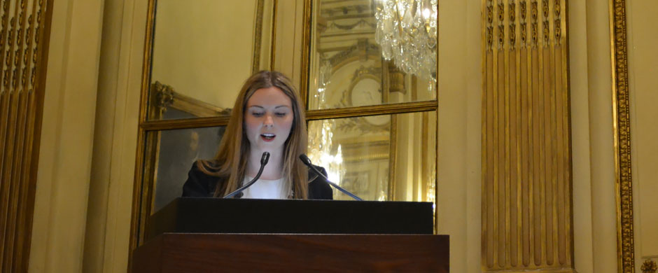
Welcome: Christine Poggi, Judy and Michael Steinhardt Director, The Institute of Fine Arts, New York University
Moderated by Peter Moore Johnson, The Institute of Fine Arts, New York University
3:10
“From Paris to Cambridge: The Harvard Upraised Fist and the Visual Language of Protest, 1968–1970”
Samantha M. Small, The Graduate Center, City University of New York
Samantha M. Small's AbstractThis paper follows the influence of fine art structures and the visual vocabulary of international student movements on protest imagery emerging from Harvard University in the late 1960s. The raised fist—a global symbol of resistance—was deployed in the red fist created by student Harvey Hacker to raise support for the Students for a Democratic Society (SDS) during the University strike of 1969. The iconography used to protest Harvard’s role in the Vietnam War and police violence against anti-War student demonstrators can be located in both the legible messaging of Parisian collective the Atelier Populaire, and Los Angeles artist Sister Corita Kent’s handcraft aesthetic.
In the 1960s protest movements swept the United States and Europe. Hundreds of thousands of leaflets, signs, and other ephemera were created to communicate generational anger with conservative institutions and the violence of the state. Design for posters, in particular, went beyond simple slogans penned on paperboard, pairing pithy yet powerful texts with images calculated to exhort action. The potent posters created by the Atelier Populaire—a group of students, artists and workers that occupied the École des Beaux Arts during the Paris strikes of May 1968—were designed to communicate to as broad an audience as possible by orienting short phrases around a schematic central image. Established artists too incorporated messages of social and political dissent into their work and exhibition practices. In Los Angeles, Kent, who was for many years a sister of the Roman Catholic order of the Immaculate Heart of Mary, called attention to social injustices through a combination of simple, often found images, and rough letterforms. This paper asserts that the Harvard fist draws from both the Atelier Populaire’s collective production of straightforward figuration, and Kent’s use of text as a composed figurative element with which to impart her increasingly politicized message.
3:35
“Touching Robert Mapplethorpe’s Photographs”
Lauren Cesiro, Binghamton University
Lauren Cesiro's AbstractBetween 1981 and 1982, Robert Mapplethorpe photographed Milton Moore and Jack Walls hundreds of times, but deployed quite distinct ways of engaging each subject. Subsequently, the photographs appeared in various differently framed projects, including Mapplethorpe’s Z Portfolio and Thomas Sokolowski’s 1983 exhibition “The Sailor 1930-1945: The Image of an American Demigod.” My paper asks how and why Mapplethorpe developed divergent strategies for photographing Moore and Walls and for contextualizing their pictures. To answer this, we will have to reconstruct the circulation of intimacies that shaped and were shaped by Mapplethorpe’s projects in the early 1980s. Drawing on largely unexamined archival materials, contact sheets, and ephemera from Mapplethorpe’s studio and his communities, I will argue that the photographs of Moore and Walls, notorious from the “Culture Wars” of the 1980s, are in fact embedded in the intimate, pleasure-driven, multiracial communities from which they arose, even while Mapplethorpe’s vision continues to engage and challenge in uncomfortable ways 1980s’ debates about looking and objectification.
4:00
“The Language of Objects: Product Semantics and Industrial Design at the Cranbrook Academy of Art”
Colin Fanning, Bard Graduate Center
Colin Fanning's AbstractUnder the broad umbrella of postmodern design—a term redolent with connotations of irony, pastiche, and rule-breaking—a strand of activity known as “product semantics” was a rather more earnest attempt to construct a set of principles for practicing industrial design through the lens of linguistics and communication. Drawing on experiments in the immediate postwar decades at the West German Ulm School of Design, by the early 1980s this discourse took root and flourished in the American design academy. The methodology of product semantics was in part a response to a marked linguistic and semiotic turn in the humanities, but it also sought insights from the cognitive and social sciences to more firmly situate the cultural and psychological dimensions of objects as part of a designer’s remit.
This talk will explore a key nexus in the product semantics discourse: the graduate program in design at the Cranbrook Academy of Art, under the joint leadership of Katherine and Michael McCoy. Along with an international network of design educators and corporate design departments, the McCoys and their students helped shape debates on the interaction between appearance, utility, and meaning in late-twentieth-century product design. The playful-yet-serious Cranbook speculations made suggestive departures from modernist orthodoxies of form and function, instrumentalizing semiotic theory to propose more communicative and meaningful mass-produced goods. At the same time, these efforts attempted to defend the relevance of industrial designers’ expertise in a quickly changing technological landscape. Documenting a moment when the emerging notion of ubiquitous computing teetered between optimism and anxiety, Cranbrook’s product semantics explorations represented a conscious pursuit of suitable formal expressions for an information age still in the process of dawning.
Intermission
Moderated by Caitlin Henningsen, The Frick Collection
4:45
“Between the Glove and the Severed Hand: Assuaging Anxiety and Claiming Identity in a 17th-century Mexican Double Portrait”
Amy Chang, Harvard University
In 2018, an exhibition opened at the Museo de America in Madrid which was centered on a single painting: a recently restored anonymous 17th century portrait from Viceregal Mexico which depicts Maria Luisa de Toledo (the daughter of the viceroy), accompanied by an indigenous servant of short stature with a tattooed face, dated to circa 1670.
In it, Maria Luisa grasps what at first looks to be a severed hand. It is only when the viewer notices the bare left hand which she lays on the head of her servant that we are assured that it is a provocatively styled glove. Meanwhile, her servant delicately holds a bouquet of pink and white roses in her right hand while she turns the back of her open left hand to the viewer, displaying fine linear tattooing and neatly cared-for nails.
In this presentation, I offer a new reading of this painting centered on Spanish Baroque portrait court formulas, racial anxiety tropes in plays, and visual and textual sources on the idea of cannibalism and body ornamentation in the Americas, that unpacks the allusion contained within the visual phrasing of the Maria Louisa de Toledo’s gloved and ungloved hands in contrast to the gathered flowers held in the tattooed hands of her companion.
Ultimately, I make the case that this painting plays with popular 17th century tropes about cannibalism and bridal blood purity to assuage anxiety and suspicion about Maria Luisa’s bloodline as an American Spaniard (or ‘Indiano’) on the Iberian marriage market, and that this composition was devised to allow her to assert her possession of a key aspect of Spanish femininity, while simultaneously claiming an American identity.
5:10
“Toward a Cultural Anthropology of Early Netherlandish Painting”
Virginia Girard, Columbia University
Virginia Girard's AbstractIn all of early Netherlandish painting, there are no triptych wings quite like the forest panels by the Bruges painter Gerard David. On the outer wings of a devotional triptych, one might expect scenes of saints or patrons. Instead, David places the viewer at the foot of a wooded clearing devoid of human figures. Painted around 1515, the panels are often identified as the first autonomous landscapes in Netherlandish art. The wings are not quite autonomous––they once opened to reveal the nativity of Christ––but the panels pose an unanswered question: what did this forest mean to the early modern viewer?
Previous historical explanations for David’s wings are framed through metaphor. True, there are biblical passages that portray God’s majesty and the coming of Christ through metaphorical references to nature, but such interpretations neglect the possibility of a more literal and localized significance inspired by the cultural practices of sixteenth-century Bruges.
In this paper, I suggest that the forest panels allude to the legends and rituals connected to Bruges’s most important civic and religious event: the annual Procession of the Holy Blood. The story of the Holy Blood relic’s recovery was celebrated alongside the recovery of the True Cross, and these events were conjoined in the fourteenth century with a third tradition that arose from Bruges’s founding myth, the White Bear Jousts. These traditions were woven into two weeks of festivities surrounding the procession, and each emerged from a myth in which the forested surroundings of Bruges featured prominently. To viewers, the forest recalled the activities and emotions associated with the prolonged holiday. David’s wings point to an underexplored dimension of study in Netherlandish painting—namely the enhancement of the viewer’s devotional experience through landscape features that evoked local traditions and folklore.
5:35
“How a Painting Signed by Giotto was Changed by Later Artists, and the Possibility of Collaboration Across Time in 15th-Century Italian Painting”
Annika Svendsen Finne, Institute of Fine Arts of New York University
Annika Finne's AbstractConservators are often hired to remove overpaint from paintings, as the intention of most conservation interventions is to clarify the vision of the initial artist, not to preserve residues of the afterlife the painting has lived. What if, however, there was a form of overpainting that was not antithetical to but compatible with the initial painter’s vision? In the right conditions, could a painting come to internalize interventions from later authors? Sol LeWitt may come to mind, but these questions were inspired by an event that took place well before the advent of twentieth-century conceptual art—when, in late fifteenth-century Florence, a polygonal painting signed by the artist Giotto in circa 1330 was cut into a rectangle, reframed, and augmented with new wedges of wood, painted with red cherubim heads.
Like many late medieval Italian artworks, Giotto’s painting can be read in multiple ways. Made to adorn the altar of a Christian chapel, the painting is clearly religious—but, made specifically for the chapel of the wealthy Baroncelli family, the painting is also secular, a complex manifestation of dynastic prestige.
Might the reworking of Giotto’s altarpiece also sustain more than one kind of reading? This intervention has plausibly been interpreted as an appreciative ‘modernization’ of a work by a famous, historic artist: an ‘updating’ of Giotto’s altarpiece to bring it stylistically in-step with architectural trends. However, it is also possible to interpret this ‘modernization’ as an extension of Giotto’s painting over time. Late medieval Italian building projects could continue for centuries—could a painting, likewise, become the shared territory of a small trans-generational society, developing and changing in its deeper future, while still keeping its tether to its initial author? My paper explores these questions, and the expanded notions of artistic authorship they inspire.
6:00
“Giles Hussey’s ‘Scheem of Triangles’: A New Approach to Portraiture in 18th-Century Britain”
Dominic Bate, Brown University
Dominic Bate's AbstractIn the second quarter of the eighteenth century, the British artist Giles Hussey (1710–1788) developed a new approach to portraiture that promised to put capturing individual human likeness on a firm mathematical footing. His guiding lights were arithmetic and geometry, and in particular the ratios of musical consonances and the perfect shape of the equilateral triangle. Aided by developments in anatomical practice and the availability of classical models from the late fourteenth century, many European artists before Hussey had devoted attention to the study of human proportions. However, most of their efforts were concerned with determining rules for the representation of ideal figures in history painting, the most elevated genre of pictorial art. As such, Hussey’s assertion that every face was proportionally in harmony with itself was an unusual intervention, and one that would have made him stand out in the competitive marketplace for portraiture in London, where he attempted to build a career from 1742. It is important to recognize the distinctiveness of Hussey’s approach to portraiture, rooted as this was in the particular circumstances of his training and early patronage in Bologna and Rome. But it would be a mistake to dismiss his studies as idiosyncratic flights of fancy that were unconnected to contemporary developments in artistic practice in Britain, as the historiographic record (or rather the lack of it) suggests. This talk contextualizes Hussey’s project to mathematize portraiture by showing how he tried to conform artistic practice to an idea of cosmic harmony associated with the ancient Greek philosopher Pythagoras. In doing so, I show why Hussey’s method of portraiture stood a chance of garnering support in London in the 1740s, where scientific, economic, and aesthetic speculation were rife. But I also show why Hussey’s approach to portraiture faced certain obstacles that in the end consigned him to art historical oblivion.
Saturday, April 9, 2022
11:00
Welcome: Ian Wardropper, Anna-Maria and Stephen Kellen Director, The Frick Collection
Moderated by Isla Stewart, The Institute of Fine Arts, New York University
11:10
“Staging Wagner’s Rheingold (1876): The Gesamtkunstwerk and the Waters of Empire”
Nicholas St. George Rogers, University of Pennsylvania
Nicholas Rogers' AbstractWhen Richard Wagner’s Ring of the Nibelung premiered in 1876, the curtain rose on the swirling depths of the river Rhine. For this production, Wagner had built an opera house that employed the most sophisticated visual technologies, in order to immerse the audience in the totalizing spectacle of his Gesamtkunstwerk, or Total Work of Art. Since before the opera even premiered, critics found in the work a close, insidious relationship between the coercive means used to overwhelm the audience’s sensoria and Wagner’s investment in contemporary debates about nationalism, race, and empire.
By undertaking a visual, literary, and musical reading of the underwater world into which the opening scene of The Ring immersed its audience, this talk will propose a new context for understanding the totality of the Gesamtkunstwerk: the visual culture of European imperialism. It is not incidental that The Ring opens underwater, as water had provided Wagner with an enduring metaphor for the unity of art and society. By plunging the audience into complete darkness, then into the depths of the Rhine, Wagner intended to effect a psychological break between the modern world and the artistic illusion pictured on stage. By these means, the audience could be completely absorbed into the artwork, and thus transformed into a united political body. By studying the relationship between the waters of empire and the totality of theater, this talk proposes a hitherto overlooked link between the politics of empire and one of the nineteenth-century’s most enduring contributions to modernist aesthetics, the “total work of art.”
11:35
“Charting a Cartographic Impulse: Art, Science, and Technology in German Jiaozhou”
Mimi Cheng, University of Rochester
Mimi Cheng's AbstractIn 1897, the German Imperial Navy invaded Jiaozhou Bay in northern China as part of a quest to influence geopolitics on a global scale. Jiaozhou and the capital city of Qingdao were to be developed into both a “model colony” and strategic port of entry to the mineral-rich hinterland. One of first projects upon seizing this territory was to measure, record, and transcribe features of the landscape in order begin transforming it into a “reservoir for Germanness.” The emphasis on the objectivity and verifiability of geographic information, as well as the technical instruments and mathematical processes used to generate them, is indicative of a documentary impulse, one that is evidenced throughout the archive of German colonialism.
Rather than analyzing geographic representations of colonial territories empirically—that is, in terms of ability to convey accurate geographic content—it is also necessary to locate their rhetorical drive. How and why were these images created? How did they contribute to a German imperial and national consciousness? This talk examines a set of topographic maps, landscape photographs, and technical drawings created by German cartographers, naval officers, and colonial bureaucrats of northern China at the turn of the twentieth century. It argues that these representations of the colonial landscape are not just objective propositions of spatial fact or political sovereignty, but functional images with their own internal logic and aesthetic language. These analyses are situated within the rise and systematization of German cartographic sciences beginning in the last quarter of the nineteenth century, a process that attempted to rationalize and condition modern vision by appealing to art, science, and technology. In rejecting an empiricist approach to these materials, this talk proposes that Germany’s attempt to transcribe the land was as much an ideological and aesthetic endeavor as it was a technical one.
12:00
“Almanacs and News in the France of Louis XIV”
Thomas Brown, Rutgers University
Thomas Brown's AbstractIn this paper I explore French seventeenth-century almanac prints, the timeliest images of major events from Louis XIV’s reign. Published by Parisian printmakers, these large prints went on sale every December and were meant to be pasted on walls of homes and shops, where they would be seen by a wide public for the duration of the next year. Each featured a small calendar and scenes commemorating key moments of the past year. When France was at war, almanacs celebrated the king’s victories; in peacetime they depicted ceremony, festivity, and diplomacy. More retrospective than reportorial, almanac prints nevertheless usually constituted the first images of such events.
The French public could read about the latest news almost as it happened in the country’s periodicals, but in most cases, to see pictures of what they had read about, the public had to wait for almanac prints to go on sale at the end of the year. A lack of timely news imagery thus can be said to distinguish this period both from the livelier French markets earlier in the same century and from the neighboring Dutch Republic, France’s adversary. This disparity demands attention.
In addition to almanacs, state-sponsored print sets, along with depictions in other media such as tapestry or painting, followed with an additional time lag. The extent to which authorities actively suppressed news images is hard to document but the visual evidence I have amassed and analyzed strongly suggests that the present was perceived as unstable and was thus largely off limits for artists. Only once an event could be tailored to the narrative of the king’s reign did it became a suitable subject. The result is that the artistic record of the events of these years, while striking both for richness and diversity, conceals a reticence towards the latest news.
Intermission
Moderated by Isla Stewart, The Institute of Fine Arts, New York University
2:00
“Multiplicity of Chinoiserie: Drawings of Chinese Architecture in the Collection of Izabela Lubomirska (1736–1816)”
Yifu Liu, Princeton University
Yifu Liu's AbstractSince the 17th century, European aristocrats had shown particular interest in Chinese architecture, which led to the proliferation of written descriptions, drawings, and prints on the subject in their collections. A lavishly illustrated album titled Essai sur l’Architecture Chinoise owned by French statesman Henri Bertin (1720-1792) has been considered the most comprehensive survey of Chinese architecture in late 18th century. Produced by Jesuits in Beijing, the Essai features over 200 watercolors of Chinese buildings. However, little is known about the circulation and influence of the Essai.
Several drawings in Poland offer a rare opportunity to study the dissemination of the Essai in the wider European context. Displayed in the so-called Chinese Room in Łanćut Castle are eight watercolors copied after the images in the Essai. These drawings belonged to Princess Izabela Lubomirska, who created the room between 1791 and 1802. An avid art collector and international traveler, Lubomirska was exposed to interior designs in England and France, of which Chinoiserie was an integral part. Meanwhile, the Łanćut Chinese Room draws inspiration from the watercolors and shows an attempt to recreate an authentic Chinese style that differs from contemporary examples.
Formal analysis of the drawings indicates the hand of a European artist, whose unfamiliarity with Chinese culture led to the mistranslation of certain visual motifs in the copies. Comparison of these copies with the Essai drawings and with the actual construction of the Chinese Room allows us to investigate the issues of accuracy and authenticity in the transmission of ideas about Chinese architecture through images. Furthermore, the Chinese Room is connected to the Pompeiian room with painted scenes of antiquity. The deliberate juxtaposition of the two spaces highlights the intersection between the Princess’s love for Chinese art and her antiquarian pursuits, adding another layer to the phenomenon of Chinoiserie in Poland.
2:25
“‘The Truer Artists’: Ichi Ban Studios and Japanese Art for American Homes”
Nina Blomfeld, Bryn Mawr College
Nina Blomfeld's AbstractIn the 1880s, import stores offering Japanese goods sprung up in urban centers across the United States. Capitalizing on interest generated by the Meiji government’s presence at public exhibitions, private enterprises marketed an artistic fantasy of Japan that allowed American consumers to participate in wider discourses of art and global politics. In San Francisco, Ichi Ban Studios (“Number One” Studios) retailed an extensive selection of silks, porcelains, and paper goods. The bulk of merchandise was imported from Yokohama but, like its competitors, Ichi Ban also offered custom pieces produced in-house by a workshop of Japanese painters and embroiderers who performed their artisanry for viewing customers.
This paper investigates a rare survival of Ichi Ban’s commissioned work, a three-paneled screen now held by the Peabody Essex Museum. The screen is signed by “F. Yata,” a panorama painter also known as Yada Issho, who worked briefly for Ichi Ban Studios before returning to Japan in 1887. Yata’s work was praised by a visiting critic who found his quick brush and “true” hand evidence of the “higher powers” of Japanese artists, echoing prevailing attitudes that linked race to innate artistic ability. The screen depicts three young white women whose faces, painted from photographs, have been affixed to kimono-clad bodies surrounded by decorative art objects similar to those sold by Ichi Ban Studios. Yata’s screen is both a portrait of the daughters of US Colonel Josiah Brodhead and a functional room-divider, a surface for representation and a means of enclosing space. As a material, visual and cultural pastiche, I argue that the screen is a record of the performance of artistic cosmopolitanism by Yata and his employer, patron, and subjects. The material traces of these performances form a link between the shifting politics of the Pacific and the domestic spaces of American life.
2:50
“A Dissonant Building: The Chilean Pavilion at the Pan American Exposition in Buffalo, New York (1901)”
Constanza Robles, Boston University
Costanza Robles' AbstractThe Pan American Exposition, held in Buffalo, New York in 1901, sought to shape relations between the American nations by constructing a shared identity in distinction with the rest of the world. The United States’ organizing committee championed hemispheric cooperation or Pan Americanism as a strategy to enforce its imperialist dominance, as well as to undermine Spain’s renewed efforts to solidify hegemony in Latin America through appeals to a common Hispanic heritage. The Buffalo exposition dovetailed with the Monroe Doctrine (1823), the Mexican American War (1848), the Spanish-American War (1898), and the creation of the Panama Canal (begun in 1904) in materializing U.S. imperial aspirations toward Latin America. The fair’s logo design, for instance, personified North and South America as two women holding hands on top of what corresponds to Central America and the Caribbean. They converge in newly acquired U.S. land – Panama - symbolizing a new American partnership and independence from European colonialism. This paper studies the visual culture of the fair, with a special focus on the Chilean pavilion and its fine arts exhibition. I consider the Chilean aesthetic program in relation to the organizer’s objectives as well as those of other Latin American nations in order to unpack the visual strategies of soft power adopted in a moment of intense competition between Spain and the United States. The Chilean pavilion contradicts the overall architectural theme of the fair -Spanish Renaissance- with a metallic building as a strategy to showcase its industrial advancement while keeping a classical nineteenth century fine arts exhibition within.
Intermission
Moderated by Peter Moore Johnson, The Institute of Fine Arts, New York University
3:35
“‘Mantiklos Apollo’ and the Limits of Representation”
Soffia Gunnarsdottir, Yale University
In survey textbooks on the history of Western art, nestled somewhere between prehistoric cave painting and the Parthenon, is a small, bronze statue of a nude youth known as the “Mantiklos Apollo.” Since 1903, when it was purchased by the Museum of Fine Arts in Boston, the Mantiklos Apollo has become the poster boy of the seventh century BCE, a representation of the transition from the “Geometric” period of ancient Greek art to the increased naturalism characteristic of the Archaic era. But behind its picture-perfect place in the canon of Western art is a notable absence of secure provenance: it is only “said to be from Thebes,” a city in the region of Boeotia, Greece, allegedly found there by local gravediggers sometime before 1894.
The statue’s name is derived from an inscription on the front of its thighs, which states the object was a gift to the “far-shooter” Apollo from a certain Mantiklos as a request for divine benefaction. In the absence of a documented findspot, the statue’s well-published time-period and canonicity rest on its perceived “geometric” form, and on an interpretation of its inscription as a label indicating who the statue represents. Surely, though, when Mantiklos dedicated the object to Apollo, the notion that his offering would be reduced to a representation as part of something called “Western art history” two and a half millennia later would have been inconceivable.
This study offers an alternative interpretation of the Mantiklos Apollo. Embracing traditional art-historical methodologies of close observation and visual analysis while challenging the primacy of stylistic development and figural representation in the study of ancient art, it examines what we can learn about the object, especially its dedication to Apollo, from its material and manufacturing processes—solid bronze and lost-wax casting—and from its manipulation.
4:00
“Color–Surface–Light: Reconsidering Monochromatic Grounds in Roman Wall Painting”
Evan Allen, Cornell University
Evan ALlen's AbstractThe late first century BCE experimentation with vast, monochromatic (back)grounds in the wall paintings of Roman Italy present modern viewers with something enigmatic. These flat planes of highly saturated color, unframed and seemingly deployed neither in the service of figural subject matter nor as a straightforward allusion to architectonic materialism, sit uneasily within the art history of a medium that privileges, over the longue durée, an increasing sophistication of figural naturalism and perspectival illusionism. From this vantage point, scholarship on Roman wall painting has long been confined to the topics of pictorial style, typology, chronology, and iconographic and iconological analysis. In turn, these single-colored backgrounds are typically dismissed as self-evident reifications of the solidity and impenetrability of the architectural surface upon which they were painted. Following such logic, the capacity for color to mean or signify anything, therefore, would be entirely dependent on its ability to look like something else, i.e. to be incorporated into some kind of mimetic subject matter rather than employed and confronted as an aesthetic phenomenon per se.
This paper reorients a study of color in Roman wall painting around the dual concerns for craft practice and aesthetic experience. The former addresses the historical phenomenon of making Roman frescoes from this period onward, wherein mural painting becomes increasingly dependent upon mixed modes of execution and labor that exceed the narrow art historical definition of ‘true fresco,’ or buon fresco. The latter takes seriously the material bulk and visual dominance of non-figural and non-representational plasterwork, investigating more fully the relationships between color, surface, and light in Roman antiquity. In turn, this paper argues that monochromatic grounds were novel strategies for mediating the visual content of fresco paintings vis-à-vis the philosophical, practical, and affective potentials for chromatic surfaces to create unprecedented sensory environments.
For most of its two-century-long existence from about 1810 to 1994, the Kowloon Walled City housed built structures, but its classification as architecture has remained tenuous. Not until the years prior to its demolition did it receive sustained attention from architects and architectural historians as a multi-story slum dwelling where crime and vernacular building practices ran rampant. However, the architectural nature of the six-acre area predated its late twentieth-century state. From its founding as a Qing military outpost, it underwent various structural additions and renovations, including an imperial Chinese bureaucratic complex known as a yamen [衙門], temples, schools, and an outer wall, after which the Walled City was named.
Against the grain of scholarship that has denied the presence of formal architecture, this paper considers the early years of the Walled City as an architectural history. The Convention of 1898 ushered in a British-led land surveying effort throughout the New Territories, followed by the creation of an intricate bureaucracy for managing land lots. This clash of empires thus saw the use of two forms of land knowledge—Qing land deeds and British cadastral land surveys—within the colony of Hong Kong. In between these systems existed the Walled City, its inhabitation falling outside the British conception of land division, but its historical contours very much shaped by the architectural boundaries that gave it its name.


